
Flux logo design
Iterations
We began with a very basic logo made during our first brainstorm session. It wasn't based on any visual identity or concept, it served mainly as a placeholder to get our thoughts rolling. The design didn't communicate anything specific about "Flux" or fluctuation, but it helped spark conversation within the group.
We wanted to represent the concept of flux visually, so we explored typographic distortion to mimic movement or fluctuation. While the idea aligned with the brand name, the execution felt chaotic. It became difficult to read, especially at smaller sizes.
What we learned with this iteration: A good concept isn't enough, execution and legibility are just as important. This version helped us realize we were too focused on the metaphor, and not enough on usability.
We shared our distorted logo with Penny. She liked that we were thinking conceptually, but told us the same thing about the issue of readability. Her feedback led us to reevaluate our priorities: we needed a logo that looked polished and could be read easily by people who don’t know the word Flux.
Amer pointed out that many of our color choices lacked contrast and weren’t accessible for colorblind users. In response, we used Adobe’s Color Contrast Analyzer and researched colorblind friendly palettes. We tested gradients that created a sense of flow (to still imply “flux”) but also passed accessibility standards.
We explored new variations where the word “Studio” was either integrated into the logo or placed separately. This helped us test how the balance of the logo affected perception and emphasis. We created two new versions and prepared for a user test.
This was the last one we made before we did a user test with all of them. We put all of these logos in a google forms and asked the students in the Oil to please fill it in and choose the best logo and why.

the last option was chosen as the best. this answer from a student also helped us create our final design.
“I think this is the best option because the word “Studio” is in the logo itself since you want to let the people know you are a studio”
Using all the feedback we came up with this logo. it uses the fluctuation that makes it look like the color is flowing through the word
Reflection:
The logo design process for Studio Flux taught us the importance of balancing creativity with readability. while we initially focused heavily on visualizing the concept of "fluctuation", early feedback quickly showed us that readability and accessibility were just as important, if not more. Throughout the iterations, we actively applied feedback from teachers like Penny and Amer, which led us to improve contrast, and test for color blindness. These technical adjustments helped move the logo from an experimental idea to something more polished and usable.
The user test with students gave us valuable insight into how others perceived our designs. The fact that the most chosen version was also the most practical (clearly showing the word "Studio") confirmed that users value clear communication in branding.
Main Video Process
First concept and script
During the project, we applied an iterative approach to make the main video. Our first version was a bit too unprofessional, After presenting it to a teacher and receiving feedback, we made adjustments to the layout and structure.
In total, we had three main iterations:
- Version 1: Initial concept with full feature list and dense layout.
- Version 2: Simplified layout, improved user guidance, removed redundant options.
- Final Version: Responsive version with clear visual hierarchy and working video loop.
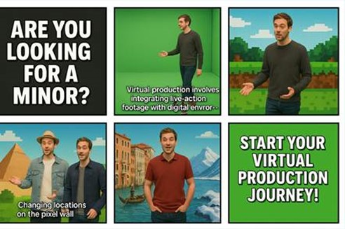
We started off by making a script for the main video, we had the idea of using the green screen in Pixel Playground to make it so that we are on multiple locations in the video, without leaving the lab.
Click the storyboard to see the script!
This is our first main video concept. here we tried saying the lines we want to say so you have an impression of what message we are trying to tell the viewer. It isn't filmed in Pixel Playground but you get a rough idea of what we are trying to do.
Feedback on this was as followed: Feedback:
-Make it more relaxed in terms of pace
-Idea is good and fun
-Add more information about the minor
-Add subtitles so it's easier to follow
for the last iteration we filmed it in Pixel playground. This provided a more controlled environment and better quality for our shots. The Pixel Playground offered better lighting conditions and a more professional setting for our video production. It was also really awesome working on a professional set where even the craziest ideas can be turned into reality (for videos)
Working iteratively helped us not only refine our designs and video, but also improve our decision making process. We learned the value of balancing concept with usability, and how structured feedback (both from users and professionals) is key to making improvements.
In the future, I want to go even deeper in early sketching phases, exploring more alternatives and documenting why certain choices are simple not fitting. That way, my work will not only improve through iteration but also show that process clearly.
Suzette really loved this video and wants to use it for the actual marketing for the minor! this is awesome news and can only mean 1 thing... We did amazing :D